WeLoan

WeLoan, or Weilidai, is WeBank’s online consumer loan product launched in 2015. And currrently one of the biggest player in the market.
Since its launch, WeLoan’s design hadn’t changed too much. And in August 2019, we decided to do a little make over.
Design
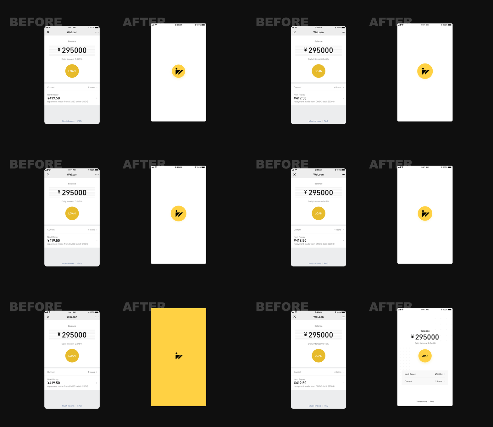
Home page redesign

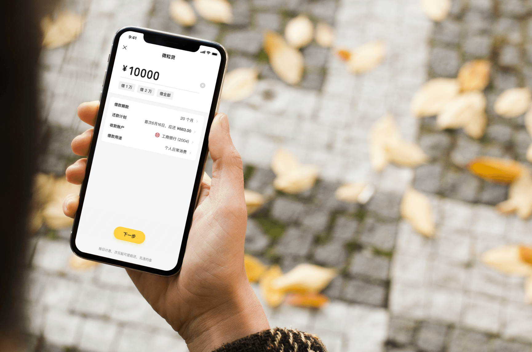
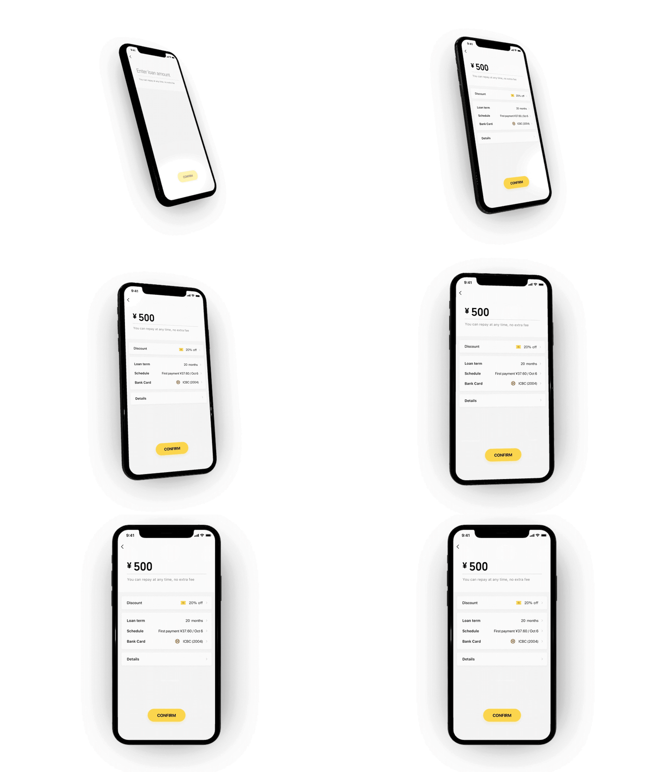
Loan page redesign, leading 0.8% improvement in conversion rate (CR), and generated 2.38 billion more loan balance in the first year.

Other pages


Motion
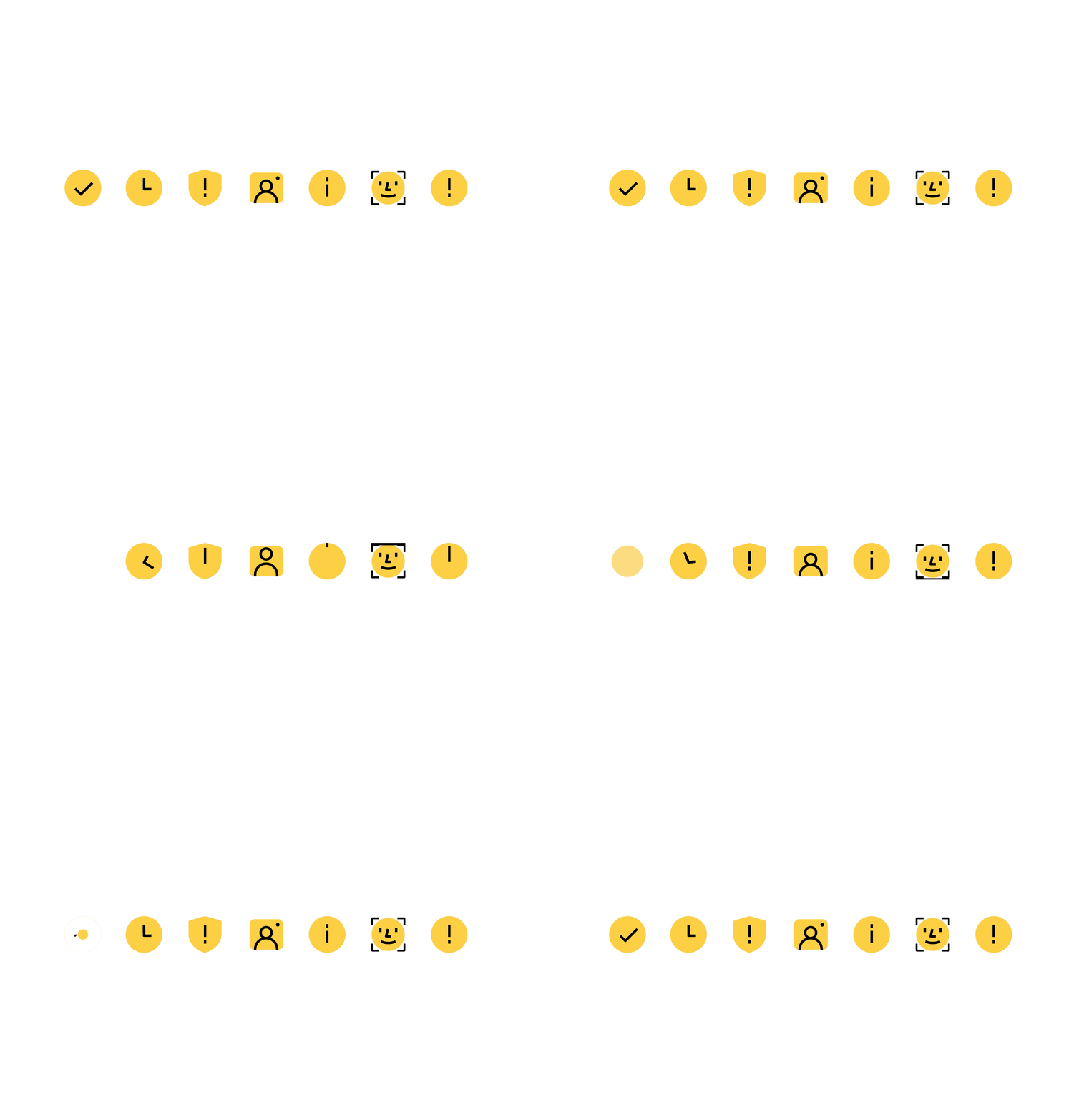
Animated icons

We used Drama to help orchestrating the animations before hand writting them in code.

We used Framer for high-fidelity prototypes on conceptual ideas.

Data Performance
Offering better user experience is not the only object of design, the interest of the stakeholders must be taken into consider, in this case, is the revenue.
The redesign improves the performance of the business in many key aspects.


Continuous Improvements
We continue to make improvements of the design base on analytics.
Shorcut buttons
Through analyzing data, we know that most people tend to enter the number by thousand. So we added shortcut buttons.

The results are satisfying.


Make Another
Another test we run is to change “Done” to “Make Another”.

Also shows promising results.
