Building Design Systems
Design systems are powerful tools to help democratize and empower the entire team, both developers and designers, to participate in the design process.
At WeBank, we use Sketch on our design from early beginning, and we maintain a library of symbols for components, like buttons, forms etc. But as our products developed, the “library” is failing in many ways.
-
Designers and designers failed to align. Due to the limitations of Sketch Symbols itself, what we can define in the library are merely single components, not page layouts, let alone design tokens. Therefore designers may have their own interpretations of a same design pattern, causing inconsistencies.
-
Designers and developers failed to align. It is a crippled one that a “design system” involves only designers. Without a corresponding “library” at the developer end, designers have to export the specs of the same button each time it appears in a page. That is not what we call consistence in design or efficiency in development.
-
Developers and developers failed to align. Without a pickup-and-use library, developers have to handwrite every component on different pages even it is the same one. It is not only inefficient but will lead to inconsistency on both design and code level.
Goals
Designers across the team should always be able to get access to the styles in production. So there should be no more inconsistencies between the .sketch file and the .css file.
Our products are on multiple platforms. So it is also important to achieve a goal: one code base, all platforms.
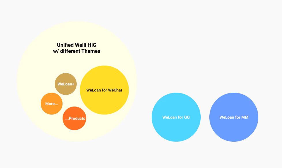
The structure of our design system. Our products are on multiple platforms like Mobile QQ and Tencent Mobile Manager, so we need to be in line with their design guidelines respectively.
We use Vue.js to build our UI components and Storybook to organize them. Component styles and code examples are documented so that both designers and developers can always be on the same page.
Process of Implementation
Design
Our first step is take stock of what we had in our original component library - buttons, textfields, icons, lists, etc. We started compiling all of that components into a single file, and from there, it was easy to see repeated applications of patterns that needed to be unified.
And then we take out sizes, margins, paddings, shadows, animation curves, and so on to organize them as design tokens.
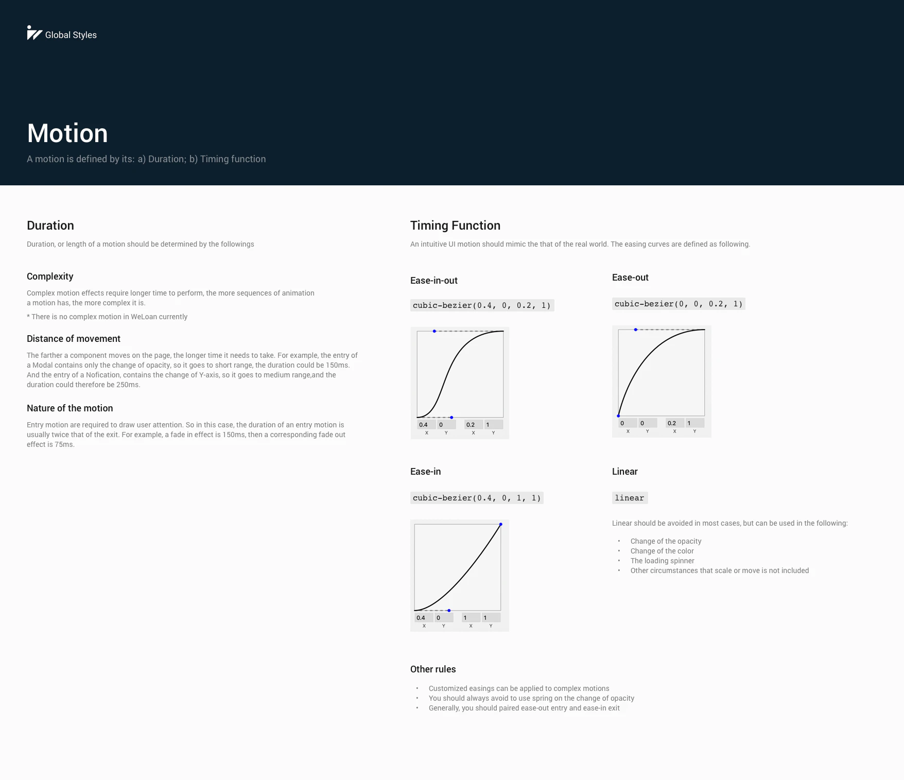
Animation easings are defined as design tokens
We also spotted the outliers, or those components that had been used only once, and therefore didn’t have a place in our system.
During the process, we also find out that some designs already in production could be unified into one. The process of organizing is also of process of a design review.
Develop
Some designs are not easy to be explained by just exporting the specs. How would you explained “I want it centered in the 60% top on the page”? In this case, I needed to get into the code myself and keep tight communications with the developer team.
I got access to the Git project so that for some minor style tweaking, I could do it myself to accelerate the process of development. And I was also included in the code review so that I could check if components would have desired logical behavior other than just style.
Documentation
A design system is supposed to be used by everyone. We don’t just finish it and leave it there so that no one but the creators know about what to do with it.
Each component or template is required to include documentations not only for developers, but also for designers. Telling them when or where to use certain component and so on.
Measure of Success
Adoption of the design system
Now that we have switched our design tool to Figma, the component library is even more powerful. We adopted the way similar to Spotify in structuring and organizing libraries. And nearly all components are used by designers in their projects.
As for the developers, new projects and all using the design system and legacy projects and in the way of replacing old components with the new.
Making Delivery Faster
With the design system established, our designers get to focus more on user experience itself rather than wasting time on checking if the padding is exactly 20px. And developers can deliver consistent pages across the whole project efficiently like building LEGOs. According to a quick survey on the new design system, the satisfaction rate is as high as 94%.
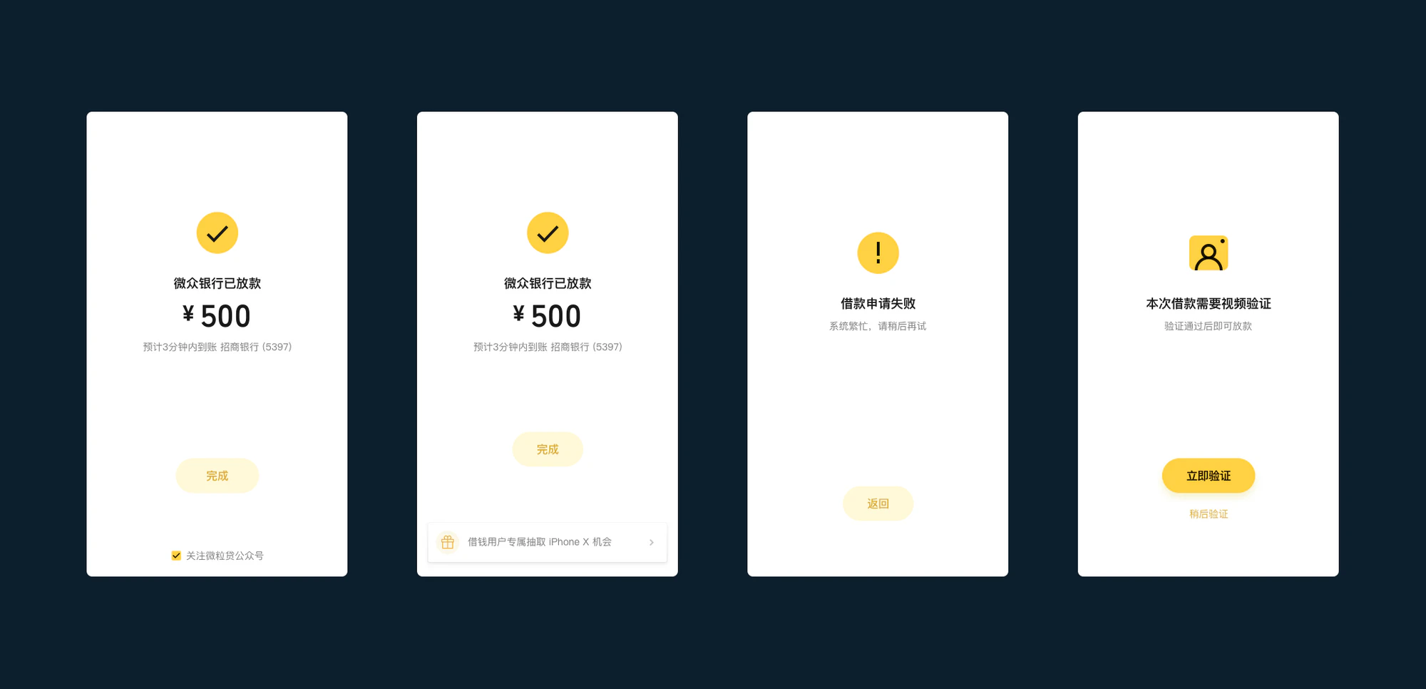
These pages variants are built with a same component.
An ever WIP
After two months of cooperation between the design team and the developer team, We’ve already been able to rely on our design system for some new projects. But As our product lines are in rapid change, breaking down the existing system from time to time is inevitable. We’re still revising and modifying as we go.